
Custom Control in C# is the next topic we are going to cover.
How to create Custom Control in C# – Source Code
Custom Control
If you are already somewhat experienced C# coder then you might have already used custom controls. Sometimes the native .NET controls are not up to the task we have at our hand. So, we must turn to something more custom.
We have already covered this topic in three other tutorials, such as:
- How to create round corner controls in C#
- How to create Round Button Control in C#
- How to create Round Corner TextBox in C#
As you can see these tutorials mostly cover the topic of rounding the edge of a control. Thus, adding some visual appeal. We solved this problem by creating a custom User Control. But, I already mentioned that there are other ways to solve this problem, and in this tutorial we will see how.
What is the difference between User Control and Custom Control
The main difference between User Control, Custom Control and Component is that they inherit from different levels in the inheritance tree:
CustomControl
   |-> Control
          |-> Component

UserControl
   |-> ContainerControl
          |-> ScrollableControl
                 |-> Control
|-> Component- Custom Control allows the programmer to take full control of its visual appearance. All the unnecessary properties and events do not exist here. Only the ones you might want to add.
- User Control is a great solution when you want to combine existing controls into reusable building blocks.
So, how do we decide which one to use? Well, If you want to create a composite control, for example having two list box controls and a button, then you might be more well off using the UserControl class. But, if you like to create a button with rounded corners, then, you might want to inherit from Control class.
As you can see, there are multiple solutions to the same problem. So, we already solved the round button problem by inheriting from a UserControl. Lines in situations like these can be blurred. It is up to you to code the best solution.
What are we going to build
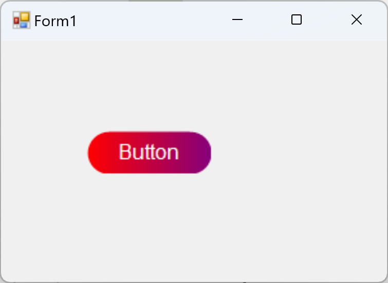
In this tutorial we are not building a complete application. We are going to showcase the custom control method of creating a button with linear gradient background and rounded corners. We are going to create this from scratch. So, let’s start coding.
Code Round Button with Linear Gradient Background
Start the coding session by adding a new class to the project.
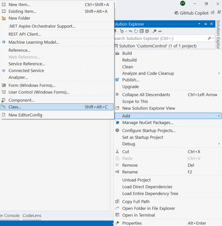
Name the new class GradientButton. Don’t worry the button will have rounded edges as well. Next, make sure your newly created class inherits from Control class.
The Control class implements very basic functionality required by classes that display information to the user. It handles user input through the keyboard and pointing devices. It handles message routing and security. It defines the bounds of a control (its position and size), although it does not implement painting. It provides a window handle (
MicrosofthWnd).
The quotation above pulled from Microsoft documentation says it all. If we inherit from Control class we will obtain the most basic functionality, but in terms of the visual representation we are responsible. This means we would have to do all the painting. And, that is exactly what we are after. Because, if we implement the painting then we are the ones deciding how the control will look like.
And we want the button to have a linear gradient fill with round corners. So, let’s see how our starting code will look like:
public class GradientButton : Control
{
    public GradientButton()
    {
    }
}
The major thing to note here is the inheritance. We will inherit from Control. Next, we need to set up the visual style for our button. This means that we are required to implement the Paint method. But before we go in and implement it, there are couple of fields that we need to declare.
Controls Fields
private LinearGradientBrush _brush;
private readonly Font _font;
private string _text = string.Empty;
[EditorBrowsable(EditorBrowsableState.Always)]
[Browsable(true)]
[DesignerSerializationVisibility(DesignerSerializationVisibility.Visible)]
[Bindable(true)]
public override string Text
{
    get => _text;
    set
    {
        _text = value;
        Invalidate();
    }
}
First, we have a LinearGradientBrush. We will use it to paint the background of the Button. You can use this class to create two or multicolor gradients. In our demo, two is enough. By default, a two-color linear gradient is an even horizontal linear blend from the starting color to the ending color along the specified line.
Right after that we are going to define the Font we are going to use. Remember, we will have a text in the middle of the button. This font field will define which font and what size out text it is going to be.
As a last field we are defining the Text. From the code you can see that the field is public, and it will be displayed at design time. The programmer then can set this property via Visual Studio or through code. However, when this property is set, we want to execute Invalidate method on the control itself.
Invalidate
When you invoke this method, it invalidates a specific region of the control and causes a paint message to be sent to said control. As a result, the Paint method will be executed, and the control will be redrawn. We need this because we have changed the text. And the change needs to be visible immediately. If for some reason we decided to opt out of calling the Invalidate method explicitly, then the change will be visible the next time control is redrawn. For example, the control will be redrawn when you move the form (main window) with your mouse. Or on resize event.
Implementing the constructor
public GradientButton()
{
    _brush = new LinearGradientBrush(
        new Point(0,10),
        new Point(200,10),
        Color.FromArgb(255, 255, 0, 0),
        Color.FromArgb(255, 0, 0, 255));
    _font = new Font(new FontFamily("Arial"), 16, FontStyle.Regular, GraphicsUnit.Pixel);
}
As you already know, it is not enough to declare the fields, you need to initialize them as well. For that we use the constructor of our control. Because this is a simple demo, the values are hard coded. But if you are making your own control you might want to rethink that decision. Most probably you would like to be able to change these properties and values at design-time.
Anyways, we create a new linear gradient brush with two linear stops. The two Point classes we are using to define where the horizontal gradient starts and where it ends. Simultaneously, we define the start gradient color and end gradient color as well. Again, like I said, you might want to expose these fields as public to the end user. However, make sure to invalidate the control so that the changes take effect.
Up next, we initialize the font. I will use “Arial” with the size of 16. Looks good to me. It is possible to expose this field as public property as well. And I encourage you to do it.
Finally, we may implement the Paint method.
Overriding the Paint method to display the Custom Control
protected override void OnPaint(PaintEventArgs e)
{
    Graphics graphics = e.Graphics;
    graphics.FillRoundedRectangle(_brush, 0, 0, Width, Height, 20);

    SizeF fontSize = graphics.MeasureString(_text, _font);
    var x = (Width - fontSize.Width) / 2;
    var y = (Height - fontSize.Height) / 2;
    graphics.DrawString(_text, _font, new SolidBrush(Color.White), new PointF(x,y));
}
Before we go on and implement the override for the Paint method, I need to explain the usage of FillRoundedRectangle method.
This is the method we are going to use in order to draw round corners. If you have missed this part and you don’t know where it is coming from, then I highly suggest you review:
Please note that you don’t have to go over the full tutorial. Just review the code for the file GraphicsExtensions.cs.
On the other hand, you can also use FillRectangle method from the Graphics class just as well. One interesting thing about this C# code is that it also shows you how to measure the font size in pixels. We need this feature so that we can properly center the font. Once we have the font size in pixels, we need to calculate the start (x, y) point so that the text is drawn right down the middle.
 SizeF fontSize = graphics.MeasureString(_text, _font);
 var x = (Width - fontSize.Width) / 2;
 var y = (Height - fontSize.Height) / 2;
The math is quite simple, and it speaks for itself. With this C# code snippet, we are centering the text in the middle of the control. All we need to do is draw it.
graphics.DrawString(_text, _font, new SolidBrush(Color.White), new PointF(x,y));This C# statement draws the _text string using the _font using a white solid color brush. Again, depending on your needs you may want to set some of these properties as public.
Custom Control Linear Gradient Button Usage
When you build the project this custom control button will appear in the Visual Studio Toolbox panel. You can drag and drop the button on the windows form. In the button properties you can find the Text property and set it to whatever you like. Then, navigate to the events tab and double click over the Click event.
private void gradientButton1_Click(object sender, EventArgs e)
{
    MessageBox.Show("Hi");
}
Then we can verify the button works correctly by displaying a message box with the informative message of: “Hi”. This is all we have time in this tutorial. If you combine your knowledge from the previous articles, you should be able to draw borders around the button and change background color on mouse hover. Everything else is up to you.
Conclusion
With this tutorial we are finishing the series on custom controls. In the first 3-part series, we used the UserControl to create a round button and round textbox. In this tutorial we saw how to create a custom linear gradient button with rounded corners from scratch by inheriting from the Control class. I doubt that there will be a continuation in this tutorial series, but if you have any questions or you would like me to implement another custom control, you can simply request a tutorial.