
A lot of you requested to create a Round Button Control in WinForms. This plea came right after I published the article on how to create round corner controls using C# in WinForms. Naturally, this article will be continuation of the work done so far.
How to create Round Button Control in WinForms C# – Source Code
Rounded Corner Button
We already mention the issue of WinForms and how difficult sometimes is to visually style controls. One such example would be rounding the edges of a button. It is not uncommon these days to want that visual appeal of your application. So, today we will learn how to create our own round button control.
What we are going to build
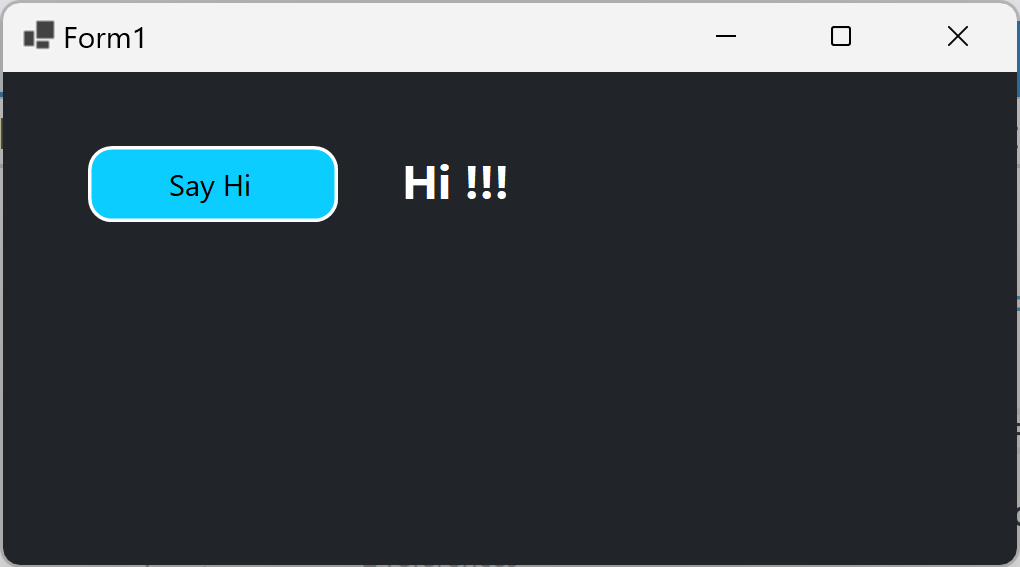
As you can see, we are going to build an application, which uses a button with rounded edges. The button is visually appealing and functional. On click, we will display the message “Hi !!!”. However, the goal is not to create some useful app, but rather show you how to create a round button control in WinForms and C#.
Round Button Control in WinForms C#
Before we start the tutorial, please note that there are multiple solutions to this problem. One way to add rounded corners to a button is to inherit from the Control class. This is something that you may have not done before, but it is worth looking into it.
If you browse through .NET documentation you will soon realize that inheriting from Control may be the best solution for this situation. This is because the control implements the vary basic functionality required by classes that display information to the user. It defines the bounds of a control (its position and size), although it does not implement painting. It provides a window handle.
The change we want to make is visual. So, it makes sense to override the Paint method. However, creating a custom control using this class will be part of another tutorial. I am keeping this solution for a more complex scenario.
Today, we will create a button control with rounded edges in a simpler manner. By reusing our previous solution.
How to create Round Corner Controls in WinForms C# tutorial shows you how to paint on a UserControl. So, if we have a user control with rounded edges, what stops us from embedding a button inside? Well, nothing really. All we need to do is blend the button inside the control. The button will be rectangular, but we can blend it to the background of the control, so it won’t show.
Alternative solution
This is a quick and dirty way of doing this, but it is also simple and quite useful for most of the projects out there. Do remember, that there will be scenarios where this solution does not fit the requirements. In such scenario investigate how you can make use of the Control class and the Paint method. This stackoverflow answer might help you a lot. However, a special dedicated tutorial will follow.
How to create Round Button Control
Before we start this tutorial, make sure you have read and implemented the tutorial from our previous post. Because, you will need the source code. Your starting solution should look something like this:
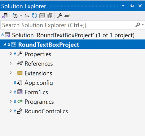
The only important files here are: RoundControl and GraphicsExtensions.cs. The RoundControl represents an empty user control with rounded edges. GraphicsExtensions class contains extension methods for the Graphics object that allow us to draw rectangle with round corners.
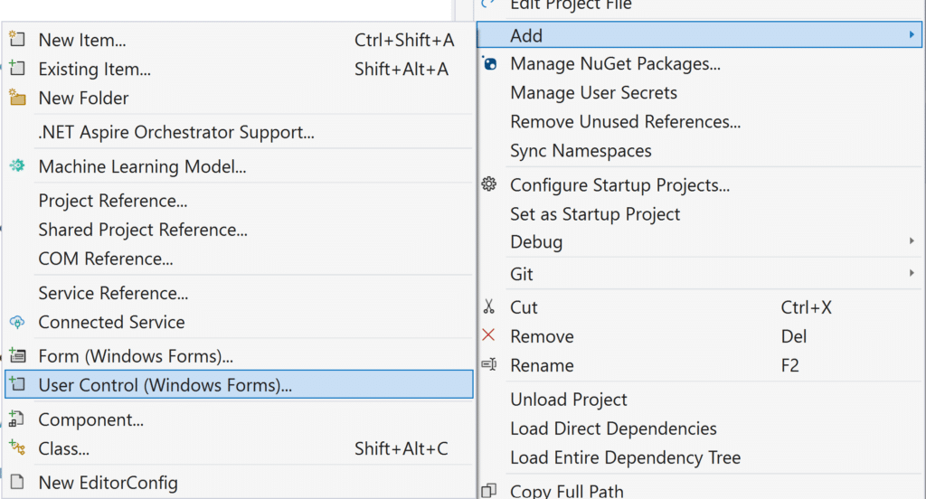
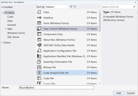
Next, add a new User Control. Name it RoundButton.
Navigate inside the code of the control and make sure to inherit from the RoundControl instead of UserControl. Then, build the solution. Your code should look like this:
public partial class RoundButton : RoundControl
{
     public RoundButton()
     {
          InitializeComponent();
     }
}
Just by inheriting from the RoundControl we already have the functionality we want – rounded corners. Please note that we also inherit the following properties: BackgroundColor, BorderColor, BorderWidth and Radius. Having these properties out of the box, makes our coding a lot simpler.
The Button
Right now, it is obvious that this control is not a button, and it doesn’t have the functionality of a button. However, we can easily upgrade this C# codebase and make it start acting as a button.
By default, a UserControl object can act as a control container only when you create the control. To make a UserControl host a constituent control after you put the UserControl on a Windows Form, you must change the default designer of the UserControl.
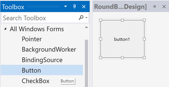
As you can see from the image above, you will need to open the designer of the RoundButton control. Once opened, you can drag and drop a button from the Toolbox inside the RoundButton control. This actually is our real button. When placed inside the container it will not look like the image above. That is ok. You need to update some of the button properties via the designer in order to achieve the same look.
The important thing to conclude here is that we have built a custom user control with round corners. Inside we can host all different types of controls. Right now, we are hosting a button. So, the button, or any other control for that manner, will need to be blended in with the background of the original control. As a result, the control will look like it has round edges.
This is really beneficial because imagine if we want to have a text box with round corners? What will you do?
Well, of course you can create a new User Control and inherit from the RoundControl and then blend the TextBox with the background. This way you can easily create a text box with round corners. I am preparing another tutorial for this as well. So, stay tuned.
Button Properties
Before moving on, let’s update some of the button properties:
Anchor: Top, Bottom, Left, Right
AutoSizeMode: GrowAndShrink
FlatStyle: Flat
FlatAppearance.BorderSize: 0
If you set the button properties like I showed you, then you should have a very similar result like the image above.
Now we are ready to code in the behavior in C#.
Coding the behavior of the Round Button Control in C#
Because we already have the visual style we want, it is time to implement the desired behavior in C# as well. Well, what do we need? First of all, this control doesn’t have the properties and behavior as a button. As a result, we need to add them.
public string ButtonText { get => button1.Text; set => button1.Text = value; }
public bool UseMouseOverBackColor { get; set; } = false;
public Color MouseOverBackColor { get; set; }
private Color backgroundColor;
As you can see from the C# code snippet, we have three public properties and one private.
- ButtonText property will display the text associated with the control
- UseMouseOverBackColor is pretty self explanatory. If this is set to true then on mouse over the button will change its background color
- MoseOverBackColor is the color that the button will use as background if the UseMouseOverBackColor property is set to true
The private field backgroundColor is a temporary variable that holds the background color of the button.
private void RoundButton_Load(object sender, EventArgs e)
{
    button1.FlatAppearance.MouseOverBackColor = Color.Transparent;
    button1.FlatAppearance.MouseDownBackColor = Color.Transparent;
    button1.BackColor = BackgroundColor;
    backgroundColor = BackgroundColor;
}
This C# code snippet handles the RoundButton control Load event. We use this event to further more blend the button with the control background. Sine, we are using flat appearance we need to set some of its properties like: MouseOverBackColor and MouseDownBackColor.
So why do we set these properties here and not in the designer? Well, as it turns out if you try to set the MouseOverBackColor and MouseDownBackColor to Transparent the designer will throw an error. This is just a workaround solution.
Remember, we do this so that we can blend the button into the control background. If the button has no border and no behaviour but the same background color then it will blend seamlessly into the control background.
Override Paint method
Next, we need to override the paint method like this:
protected override void OnPaint(PaintEventArgs e)
{
    base.OnPaint(e);
    button1.Location = new Point(20, 20);
    button1.Size = new Size(Size.Width - 40, Size.Height - 40);
    button1.BackColor = BackgroundColor;
}
First, we start by calling base.OnPain(e). This will allow the RoundControl to draw the rounded corners of the RoundButton control. Then, as you can see we set the location and the size of the button. I decided to put this code here since I want the changes to always be reflected whenever the button is redrawn. Please note that this code is also used by the designer as well. That is the reason why button1.BackColor = BackgroundColor is placed in the OnPaint event. As a result, If the background color is changed during Design Time, the changes will be reflected immediately.
The “Magic Numbers”
If you are not familiar with the expression: magic numbers. Then please read about it here. I do not condone using code like this and it should be avoided. However, this is a tutorial on how to create Round Button Control and not how to write clean code. This is the only reason why I left the code as it is shown in the C# code snippet.
To sum it up: A magic number in C# is a unique value with unexplained meaning. This definition should scare you off from writing code like this. At the very least replace this value with a properly named constant.
So, how did I get to these values? Well, based on a couple of test I did, it turned out that the best location for the button should be X = 20 and Y = 20. Why not place the button at position (0,0)? Because the button rectangle itself will overlap with the rounded corners of the control.
Same logic goes for the Width and Height. You just have to take into consideration that the button starts at position (20,20) and you reserve 20 additional pixels spacing for the control to draw the rounded edges on the bottom and the right side.
Round Button Click Event
Since I did not want to add new Click event I am using the one already hooked to the UserControl itself. This leads me to handle the Button_Click like so:
private void button1_Click(object sender, EventArgs e) => InvokeOnClick(this, e);This C# code allows me to raise Click event when the control is clicked or the button is clicked. I am doing this because of the space left between the RoundControl and the Button. If the user clicks at position (0,0) of the control, it will raise the Click event of the control. But if the user clicks on the button the event is handled so that the Click event of the control is raised as well.
private void button1_MouseEnter(object sender, EventArgs e)
{
    if (UseMouseOverBackColor)
        BackgroundColor = button1.BackColor = MouseOverBackColor;
}
private void button1_MouseLeave(object sender, EventArgs e)
{
    if (UseMouseOverBackColor)
        BackgroundColor = button1.BackColor = backgroundColor;
}
private void RoundButton_MouseEnter(object sender, EventArgs e) => button1_MouseEnter((object)sender, e);
private void RoundButton_MouseLeave(object sender, EventArgs e) => button1_MouseLeave((object)sender, e);
Round Button Mouse Events
Since I did not want to create a plain button, I added some effects on MouseEnter and MouseLeave events. The C# code snippet is pretty obvious. We are changing the background of the round button when the mouse pointer enters the button and then leaves it as well. The only thing noteworthy here to explain is that we do this for both controls: the RoundButton and Button itself. This is because they are separate controls. Meaning that once you enter in one control, you leave the other. So, they have to be synced.
Conclusion
There are many ways C# and .NET allows us to implement round corner design. I think this solution is very simple and easy to follow. It will be at a satisfactory level in many projects that require improving the visual style of the classic controls. However, in times when we need something quite custom, then you have to look elsewhere for a solution. To be more specific, you will need to inherit from Control class. We will create a brand new tutorial explaining how to handle that type of situation. But, before doing that, we can quickly create round cornered text box using the same principles we explained here.