

In this article, we will see how to create a toggle button in WPF. I really like the design of the iOS toggle buttons, so I really liked the idea to implement my own into my project. This is not the final outcome. This button is static. Meaning it doesn’t have any animations. It can belong to one of two states: ON or OFF.
How to Create Toggle Button in WPF – Source Code
In the next part of the tutorial we will create a sliding animation where the Toggle Button will slide from left to right and right to left. As an addition to the project, we will also implement text. There will be one text string shown when the button is ON and another, when the button is in the OFF state.
Let’s start and look at the WPF and XAML code.
Toggle Button Design
Because we would like to reuse this button, make sure to create it under a User Control (WPF).
<UserControl
    x:Class="ToggleButton.ToggleButtonControl"
    xmlns="http://schemas.microsoft.com/winfx/2006/xaml/presentation"
    xmlns:x="http://schemas.microsoft.com/winfx/2006/xaml"
    xmlns:d="http://schemas.microsoft.com/expression/blend/2008"
    xmlns:local="clr-namespace:ToggleButton"
    xmlns:mc="http://schemas.openxmlformats.org/markup-compatibility/2006"
    x:Name="control"
    d:DesignHeight="50"
    d:DesignWidth="150"
    PreviewMouseLeftButtonUp="ToggleButton_Click"
    mc:Ignorable="d">
    <UserControl.Resources>
        <local:HalfOfConverter x:Key="halfOfConverter" />
        <local:CircleConverter x:Key="circleConverter" />
        <local:BoolToHorizontalAllignementConverter x:Key="boolToHorizontalAlignement" />
    </UserControl.Resources>
    <Grid>
        <Border
            x:Name="background"
            Width="{Binding ElementName=control, Path=Width}"
            Height="{Binding ElementName=control, Path=Height}"
            Background="Gray"
            BorderThickness="0"
            CornerRadius="{Binding ElementName=control, Path=Height, Converter={StaticResource halfOfConverter}}">
            <Border
                Width="{Binding ElementName=control, Path=Height, Converter={StaticResource circleConverter}}"
                Height="{Binding ElementName=control, Path=Height, Converter={StaticResource circleConverter}}"
                Margin="3,0,0,0"
                HorizontalAlignment="{Binding ElementName=control, Path=IsChecked, Converter={StaticResource boolToHorizontalAlignement}}"
                VerticalAlignment="Center"
                Background="White"
                CornerRadius="{Binding ElementName=control, Path=Height, Converter={StaticResource halfOfConverter}}" />
        </Border>
    </Grid>
</UserControl>
For now, we will skip over the User Control Resources and focus on the XAML code that designs the Toggle Button.
As you can see, we start with a Border control. This border represents the background of the user control. We have quite straightforward binding to its Width and Height properties. They are bind to the Width and Height of the control itself. I use a static background colour – Gray. The border thickness is set to 0, but of course you might want to change that. It is up to you. Now let’s talk about the corner radius.
WPF and Value Converters
In my opinion the corner radius is best set to half the size of the height of the control. We can do that via C# code, but I would prefer to use a Value Converter. I call this one: HalfOfConverter and here is the C# implementation:
HalfOfConverter
internal class HalfOfConverter : IValueConverter
{
    public object Convert(object value, Type targetType, object parameter, CultureInfo culture)
    {
        double currentValue = (double)value;
        return currentValue / 2;
    }

    public object ConvertBack(object value, Type targetType, object parameter, CultureInfo culture)
    {
        double currentValue = (double)value;
        return currentValue * 2;
    }
}
As you can see the corner radius of the Toggle Button control in WPF will be half of the Height property size of the control itself.
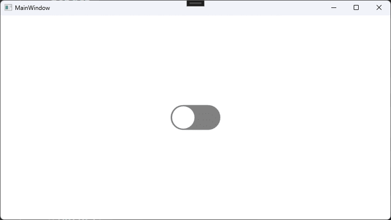
If you finished all the steps so far, you should have the following result:
Please feel free to change the background colour from Gray to whatever you like. In the next tutorial we will also upgrade the control with this feature. So, make sure to come back.
What is missing now is the circle indicator inside the Toggle Button. Of course, we can use the Circle but I am using another border embedded into the background border control. Here is the XAML WPF code snippet:
<Border
    Width="{Binding ElementName=control, Path=Height, Converter={StaticResource circleConverter}}"
    Height="{Binding ElementName=control, Path=Height, Converter={StaticResource circleConverter}}"
    Margin="3,0,0,0"
    HorizontalAlignment="{Binding ElementName=control, Path=IsChecked, Converter={StaticResource boolToHorizontalAlignement}}"
    VerticalAlignment="Center"
    Background="White"
    CornerRadius="{Binding ElementName=control, Path=Height, Converter={StaticResource halfOfConverter}}"
    Visibility="Hidden" />
First, we want this embedded border control to look like a circle. For that reason, both the Height and the Width properties must be the same. However, I would like the circle to be just a little bit smaller than its parent control. So, for that we create another value converter. Here is the C# code implementation:
Circle Converter
internal class CircleConverter : IValueConverter
{
    public object Convert(object value, Type targetType, object parameter, CultureInfo culture)
    {
        double currentValue = (double)value;
        return currentValue - 5;
    }

    public object ConvertBack(object value, Type targetType, object parameter, CultureInfo culture)
    {
        double currentValue = (double)value;
        return currentValue + 5;
    }
}
Please note that this is not an ideal solution. It is just me playing with the Value Converters and using them inside my WPF project. From the C# code above you can see that the circle will be 5 pixels smaller than its parent Toggle Button control.
Toggle Button Margin
I do like the idea of the button having some distance/margin from the left and the right. To do that we simply set the Margin property to:
Margin="3,0,3,0"Circle Allignment
One of the properties that a Toggle Button has is what happens when you turn it On or Off. In my control, when the circle is aligned on the left side, it means the control is in the Off state. That is indicated by the background being Gray.
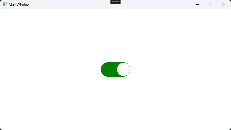
On the other hand when the circle is aligned to the right side of the control, it means that the Toggle Button control is in On state. This is indicated by changing the background colour of the control. That’s all good and dandy when being said, but let’s see how we can easily implement it into our WPF project.
More on DevInDeep:
- How to Create Custom Control in C# and WPF
- How to Implement Round Corner Text Box Control
- How to Automate Web Browser in C#
First let’s look at the binding:
HorizontalAlignment="{Binding ElementName=control, Path=IsChecked, Converter={StaticResource boolToHorizontalAlignement}}"You already know that the circle alignment will be Left or Right. So this is the property we want to edit. Now the question arises, what causes the circle to move? Well, that’s easy, just check the IsChecked property of the control. If the Toggle Button is in On state the IsChecked property will have the value of true, otherwise it will be false.
So, it comes naturally to bind the alignment to the IsChecked property (which we will implement a little later). But, we can not simply assign bool type to HorizontalAlignment type. It’s impossible. As a result, we need another converter.
Here is the C# code implementation:
BoolToHorizontalAlignment Converter
internal class BoolToHorizontalAllignementConverter : IValueConverter
{
    public object Convert(object value, Type targetType, object parameter, CultureInfo culture)
    {
        bool currentValue = (bool)value;
        return currentValue ? HorizontalAlignment.Right : HorizontalAlignment.Left;
    }

    public object ConvertBack(object value, Type targetType, object parameter, CultureInfo culture)
    {
        HorizontalAlignment currentValue = (HorizontalAlignment)value;
        return currentValue == HorizontalAlignment.Left ? false : true;
    }
}
This C# code tells us nothing new. It simply converts bool to HorizontalAlignment. If the IsChecked property is set to True then we return HorizontalAlignment.Right else we return HorizontalAlignment.Left.
Other Properties
We are almost there. I chose to set the colour of the circle as white. I like that so I am using it. Please feel free to choose another colour. And the last thing is choosing the rounded corner radius value. I like to use the same pattern as before so our WPF XAML code ends up looking like this:
CornerRadius="{Binding ElementName=control, Path=Height, Converter={StaticResource halfOfConverter}}" />Or in other words, we bind to the Height property of the Toggle Button control and calculate half of it. In the WPF designer we should see the following result:
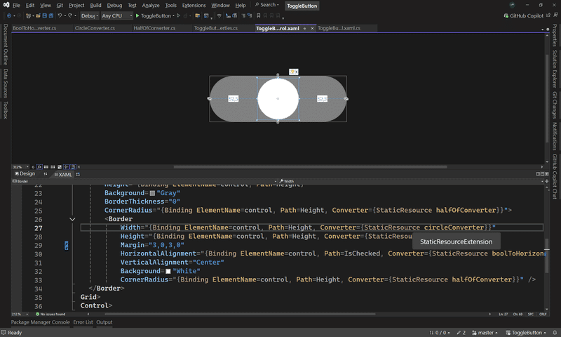
Toggle Button Control Properties
If you were following this tutorial closely, you might noticed that couple of properties were missing. Let’s add them now:
public static readonly DependencyProperty IsCheckedProperty =
DependencyProperty.Register(
    name: "IsChecked",
    propertyType: typeof(bool),
    ownerType: typeof(ToggleButtonControl),
    typeMetadata: new FrameworkPropertyMetadata(defaultValue: false));
public bool IsChecked
{
    get => (bool)GetValue(IsCheckedProperty);
    set => SetValue(IsCheckedProperty, value);
}

public static readonly DependencyProperty OnColorProperty =
DependencyProperty.Register(
    name: "OnColor",
    propertyType: typeof(Color),
    ownerType: typeof(ToggleButtonControl),
    typeMetadata: new FrameworkPropertyMetadata(defaultValue: Colors.Gray));
public Color OnColor
{
    get => (Color)GetValue(OnColorProperty);
    set => SetValue(OnColorProperty, value);
}
The first on is IsChecked property which indicates if the Toggle Button is in On or Off state. The second property is OnColor which indicates what colour to use the the user checks the button. Because this tutorial is already pretty long, I am not implementing OffColor property as well as custom text string which can be shown to the user.
Finally, there is one more event to handle:
private void ToggleButton_Click(object sender, MouseButtonEventArgs e)
{
    IsChecked = !IsChecked;
    background.Background = IsChecked ? new SolidColorBrush(OnColor) : new SolidColorBrush(Colors.Gray);
}
Every time the user clicks the button its state changes. That is represented by the first C# statement.
The next one sets the background colour. I chose to implement this feature in C# code rather than XAML because I am preparing another tutorial on Multi Value Converters in WPF. As for now, just bare with me. Some of the code issues we will address in another tutorial. But this will work as expected.
To summarize, if the button is checked then its background will be set from the OnColor property. If the button is in Off state then the background will be set to Gray.
Conclusion
This is actually quite an interesting project with a very peculiar implementation. We will improve this Toggle Button control in one of our next tutorials. But, as for right now, this will do the trick.
Next we will see how to add animations, use multi value converters, improve naming and binding. Then we will add a custom text that can be shown to the user when the button is On or another when the button is Off.